R for Data Science:: Relational data
우리는 많은 data table을 가질 수 있고, 특정한 질문의 답을 하기 위해서 그것들을 결합할 수 있어야 한다.
data table이 individual data인 경우가 아닌 관계형 데이터(relational data)일 때, 우리는 두 데이터 table을 합치는 방법을 알고 있어야 한다.
library(tidyverse)
library(nycflights13)
print(airlines)
print(airports)
print(planes)
print(weather)
- airlines 데이터는 항공사의 풀네임과 약식 이름을 제공해준다.
- airports 데이터는 faa airport code로 식별되는 각 공항들의 정보를 제공한다.
- planes 데이터는 tailnum으로 식별되는 각 항공기별 정보를 제공한다.
- weather 데이터는 시간별로 NYC 공항에서의 날씨정보를 제공한다.
각 data table을 아래와 같은 connection이 있다.
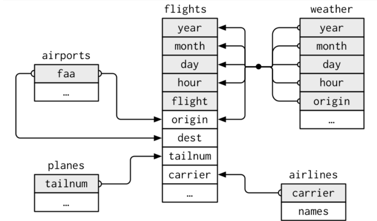
flights -> tailnum -> planes
flights -> origin, dest -> airports
flights -> carrier -> airlines
flights -> year, month, day, hour, origin -> weather
- key
각 table 쌍을 연결하는데 사용되는 변수를 key라고 한다. key는 observation을 고유하게 식별하는 변수이다.
예를 들어 간단한 경우에 어떤 한 변수는 observation을 식별하는데 충분할 수 있다. 항공기는 tailnum으로 식별된다. 그 값이 고유하기 때문이다.
또 다른 경우 여러 변수의 값이 필요한 경우도 있는데, 예를 들어 날씨를 관측하기 위해서는 연도, 월, 일, 시간, origin. 총 5개의 변수 값이 필요하다.
planes %>%
  count(tailnum) %>%
  filter(n > 1)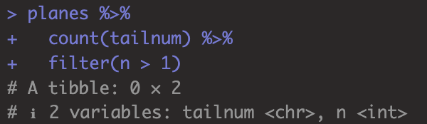
table에서 특정 변수가 key라는 생각이 들었더라도, 실제로 고유한 값인지 확인할 필요가 있다.
tailnum은 planes에서 고유한 값으로 확인됐다.
weather %>%
  count(year, month, day, hour, origin) %>%
  filter(n > 1)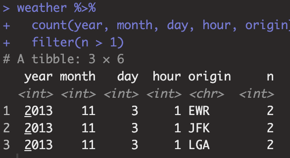
key(year, month, day, hour, origin)는 위의 경우에서 고유값을 갖지 않는다. 동일한 조건에서 다른 weather value를 갖기 때문이다.
- mutating join
mutating join을 사용하면 two table을 특정 변수를 기준으로 결합할 수 있게 된다. 첫 번째로 관측치를 우리가 지정한 key에 대해서 matching하고, 한 테이블을 다른 테이블로 copy한다. 예시로 이해해보자.
flights2 <- flights %>%
  select(year:day, hour, origin, dest, tailnum, carrier)
flights2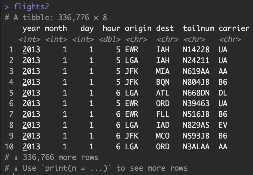
airlines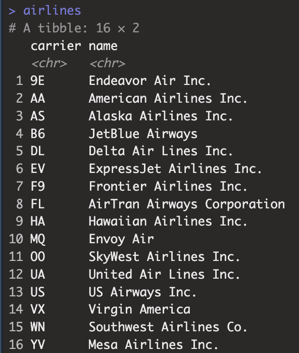
flights2 %>%
  select(-origin, -dest) %>%
  left_join(airlines, by = 'carrier')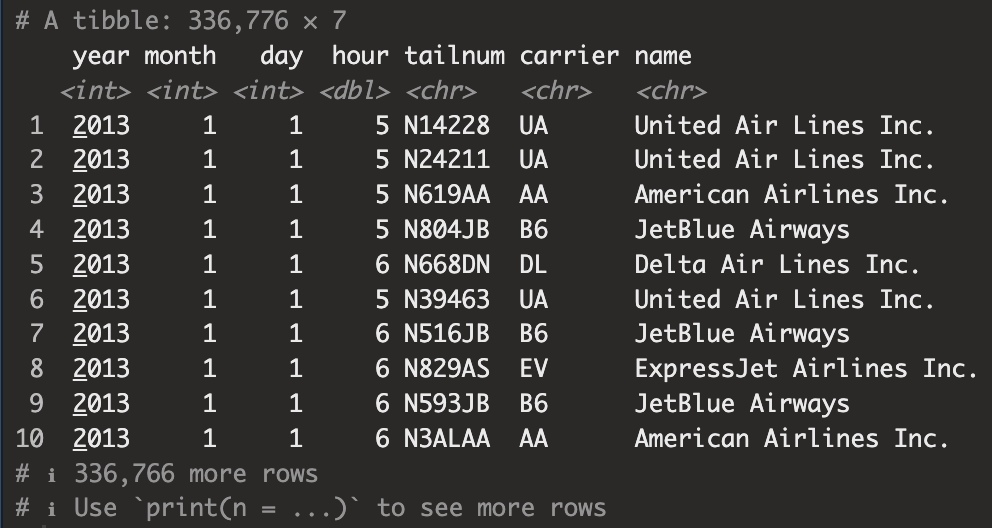
변수 carrier를 Key로해서 flights2 table과 airlines table을 left_join()한 결과이다.
join함수에는 여러 유형이 있다.
- inner join
- outer join
- left join
- right join
- full join
각각의 join 어떻게 다른지는 코드를 통해 익혀보자.
x <- tribble( ~key, ~val_x,
              1, "x1",
              2, "x2",
              3, "x3"
              )
y <- tribble( ~key, ~val_y,
              1, "y1",
              2, "y2",
              4, "y4"
              )
tribble()함수는 tibble을 만드는 또 다른 함수이다.
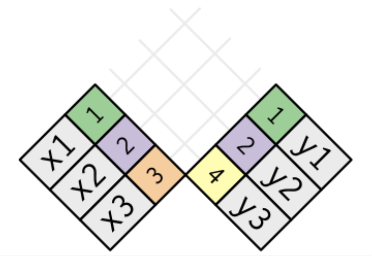
현재 table x와 y의 관계를 살펴보자. 그럼처럼 key변수로 연결되어 있는 것을 확인할 수 있다.
이제 table x와 y로 각각의 join함수가 어떻게 사용되는지 공부해보겠다.
- inner_join()
x %>%
  inner_join(y, by = 'key')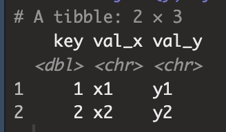
x의 key변수에는 1, 2, 3이 있었고 y의 key변수는 1, 2, 4가 있었다.
inner_join의 결과는 x의 key변수와 y의 key변수중 공통으로 존재하는 value를 기준으로 y table의 관측값들을 x table에 결합시킨다.
때문에 y의 table에서는 key value 1,2가 x table의 key value과 공통되기 때문에 위와 같은 결과를 반환한다.
이렇게 이해해보자.
inner -> 교집합
left -> x의 모든 관측값
right -> y의 모든 관측값
full -> x,y의 모든 관측값 합집합
뭔 말인지 모르겠으면 코드로 보자
x %>%
  left_join(y, by = 'key')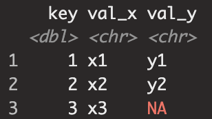
left_join이므로 x의 모든 관측값에 대해서 y table 결합. 때문에 y table에는 key value가 3인 관측이 없기 때문에 NA가 확인된다.
x %>%
  right_join(y, by = 'key')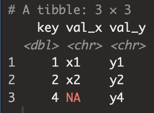
right_join은 y의 모든 관측값을 기준으로 결합하기 때문에 key value 4를 갖고 있지 않은 x의 val_x는 NA값을 보인다.
x %>%
 full_join(y, by = 'key')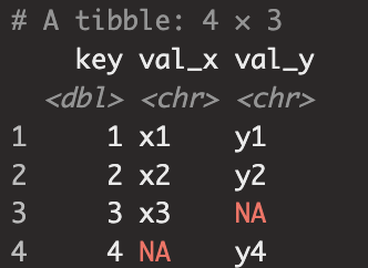
x의 모든 key 1,2,3, y의 모든 key 1,2,4 때문에 각각 4, 3에 대해서 관측값을 갖고 있지 않아 NA값이 2개 존재한다.
- join (one to many relationship)
key value에 있어서 고유값이 한 개가 아닌 경우도 있다. one to many relationship에서 join이 어떻게 적용되는지 확인해보자.
x <- tribble(
  ~key, ~val_x,
  1, "x1",
  2, "x2",
  2, "x3",
  1, "x4"
)
y <- tribble(
  ~key, ~val_y,
  1, "y1",
  2, "y2"
)
left_join(x, y, by = "key")

left_join(y, x, by = "key")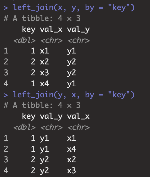
- join (many to many relationship)
x <- tribble(
  ~key, ~val_x,
  1, "x1",
  2, "x2",
  2, "x3",
  3, "x4"
)
y <- tribble(
  ~key, ~val_y,
  1, "y1",
  2, "y2",
  2, "y3",
  3, "y4"
)
left_join(x, y, by = "key")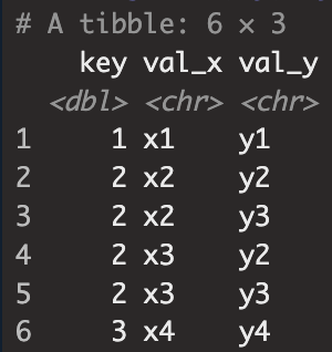
우리가 2개의 table을 join할 때, key로 지정한 변수명이 같은 경우가 있다. 이 경우에는 특별히 신경쓸게 없이, 앞에서 했던 과정을 그대로 적용하면 된다.
flight2 %>%
  left_join(planes, by = 'tailnum')
하지만 flights2 데이터의 변수 dest가 airports 데이터의 변수 faa와 다른 이름의 key를 가지고 있을 때( 물론 가지고 있는 고유값으로써의 value는 같다. 둘다 공항코드를 가지고 있는 변수인데 변수명만 다른 경우..)
이런 경우 join하는 방법을 공부해보자.
- join(x, c('X1' = 'X2'))
flights2 %>%
  left_join(airports, c('dest' = 'faa'))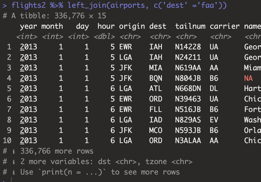
flights2 %>%
  left_join(airports, c('origin' = 'faa'))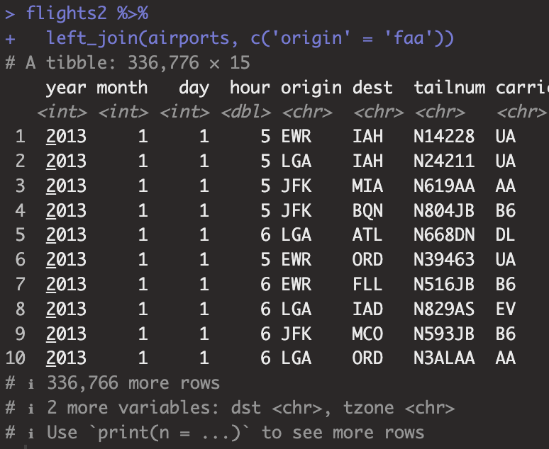
- semi_join(), anti_join()
top_dest <- flights %>%
  count(dest, sort = TRUE) %>%
  head(10)
top_dest

flights %>%
  filter(dest %in% top_dest$dest)
위 코드는 flights 데이터에서 dest별 개수를 새고 내림차순 정열해서 top10을 뽑은 top_dest를 만들고
top_dest의 dest만 flights 데이터에서 보이는 코드이다. 위 코드를 semi_join()함수를 사용하여 쉽게 짤 수 있다.
flights %>%
  semi_join(top_dest, by = 'dest')
semi_join은 mutating join과 달리 관측값이 존재하는지에만 관심이 있다. 관측값이 존재한다면 x table에서 보여주고 없으면 안보여주는 고런 느낌으로 생각하면 될 것 같다.
anti_join()은 semi_join()과 정반대다. y의 관측값과 겹치는 x의 관측값에 대해서 배제하고 보여준다.
flights %>%
  anti_join(planes, by = 'tailnum') %>%
  count(tailnum, sort = TRUE)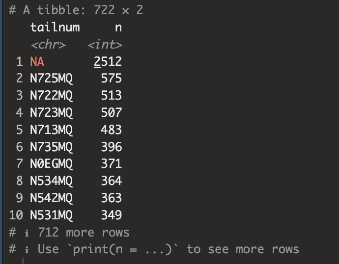
- Exercise
1. Compute the average delay by destination, then join on the airports data frame so you can show the spatial distribution of delays, Here's an easy way to draw a map of the United States:
airports %>%
  semi_join(flights, c("faa" = "dest")) %>%
  ggplot(aes(lon, lat)) +
  borders("state") +
  geom_point() +
  coord_quickmap()
목적지별 평균 지연을 계산한 다음, airports data frame에 join하여 delay의 spatial distribution를 표시해보자. 위에 코드는 미국 지도를 그리는 쉬운 방법이다.
우선 목적지별 평균 지연을 구해서 airport table과 join해주자.
avg_dest_delays <-
  flights %>% group_by(dest) %>%
  summarise(delay = mean(arr_delay, na.rm = TRUE)) %>%
  inner_join(airports, by = c(dest = 'faa'))
그리고 위에 미국지도를 그리는 방법을 이용하자.
avg_dest_delays %>%
  ggplot(aes(lon, lat, colour = delay)) +
  borders("state") +
  geom_point() +
  coord_quickmap()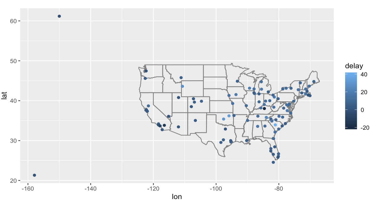
2. Add the location of the origin and destination ( lat and lon ) to flights.
airports_location <- airports %>% select(faa, lat, lon)

flights %>% left_join(
  airports_location,
  by = c(origin = 'faa')
  ) %>%
  left_join(
    airports_location,
    by = c(dest = 'faa'),
    suffix = c('_origin','_dest')) %>%
  select(origin, lat_origin, lon_origin,
         dest, lat_dest, lon_dest, everything())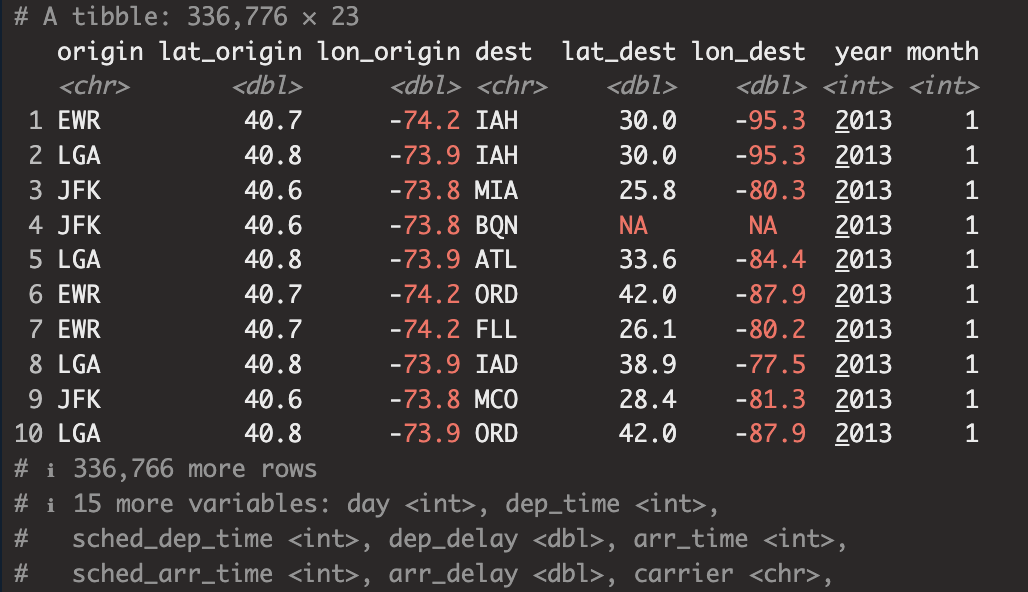
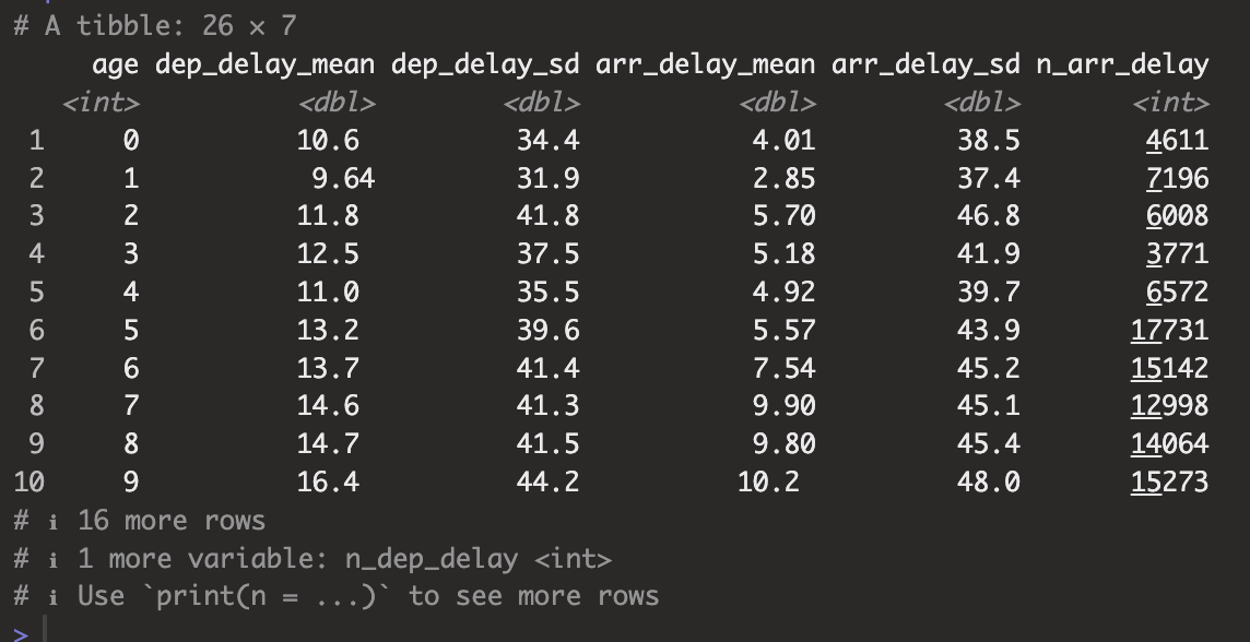
3. Is there a relationship between the age of a panes and its delays?
항공기의 연식(age)과 delay간 상관관계가 있는가?
plane_cohorts <- inner_join(flights,
  select(planes, tailnum, plane_year = year),
  by = "tailnum"
) %>%
  mutate(age = year - plane_year) %>%
  filter(!is.na(age)) %>%
  mutate(age = if_else(age > 25, 25L, age)) %>%
  group_by(age) %>%
  summarise(
    dep_delay_mean = mean(dep_delay, na.rm = TRUE),
    dep_delay_sd = sd(dep_delay, na.rm = TRUE),
    arr_delay_mean = mean(arr_delay, na.rm = TRUE),
    arr_delay_sd = sd(arr_delay, na.rm = TRUE),
    n_arr_delay = sum(!is.na(arr_delay)),
    n_dep_delay = sum(!is.na(dep_delay))
  )
우선 flights table과 planes 데이터의 tailnum, year(plane_year)를 select하여 tailnum을 기준으로 inner_join하였다.
그리고 inner_join한 table에 mutate함수를 사용하여 age를 생성 age는 항공편이 일어난 year - plane_year로 만들었다.
그런 다음 age값에 결측치가 없는 데이터만 필터링, planes table에 없는 항공기로 운행된 항공편도 있기 때문에 결측치가 존재할 수 있었다.
그런 다음 age로 그룹핑한 결과에 대해서 age별로 summarise()함수를 돌렸다. 구해본 집계는 평균과 표준편차, delay된 횟수이다.
그리고 dep, arr별로 시각화
ggplot(plane_cohorts, aes(x = age, y = dep_delay_mean)) +
  geom_point() +
  scale_x_continuous("Age of plane (years)", breaks = seq(0, 30, by = 10)) +
  scale_y_continuous("Mean Departure Delay (minutes)")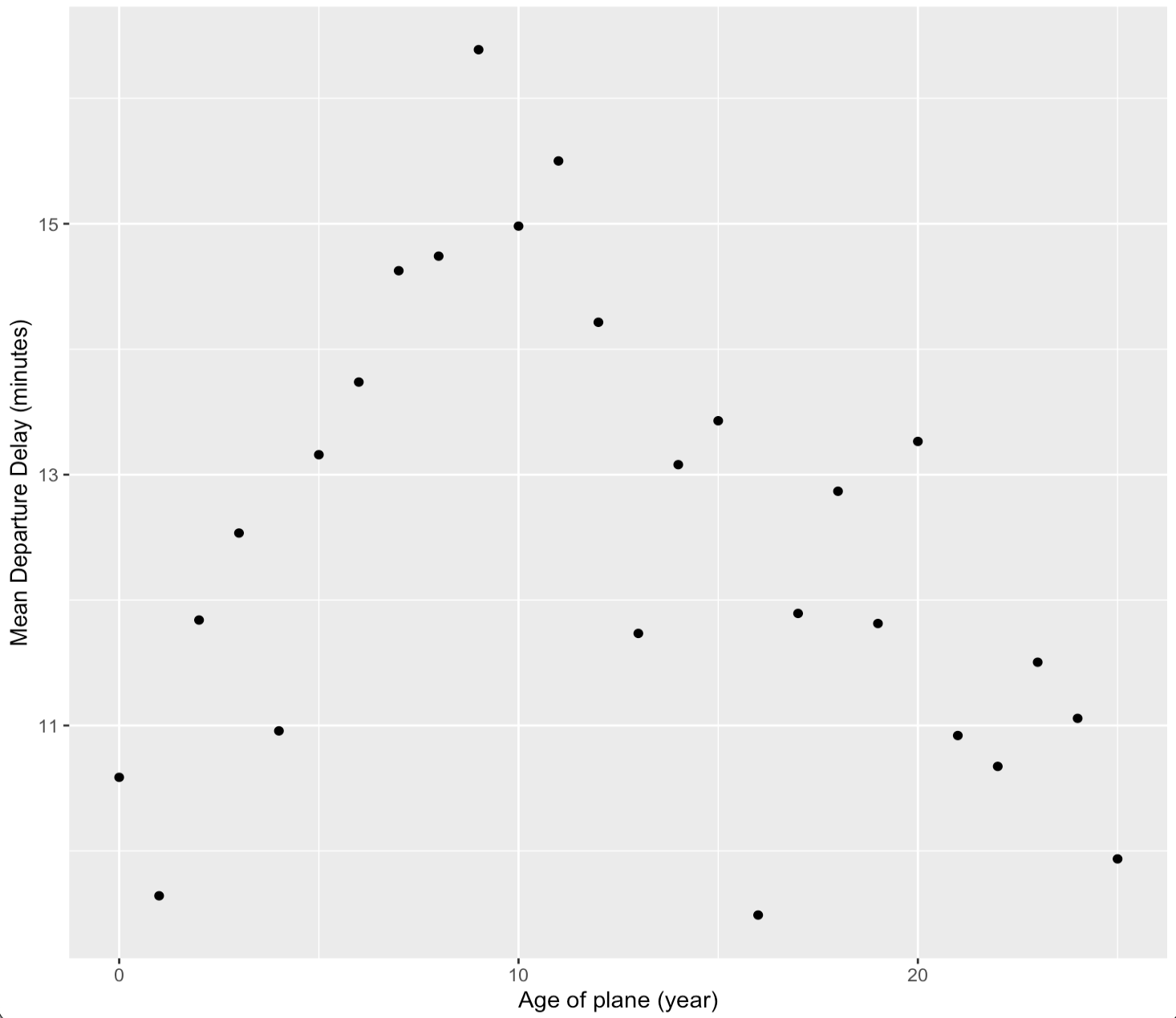
ggplot(plane_cohorts, aes(x = age, y = arr_delay_mean)) +
  geom_point() +
  scale_x_continuous("Age of Plane (years)", breaks = seq(0, 30, by = 10)) +
  scale_y_continuous("Mean Arrival Delay (minutes)")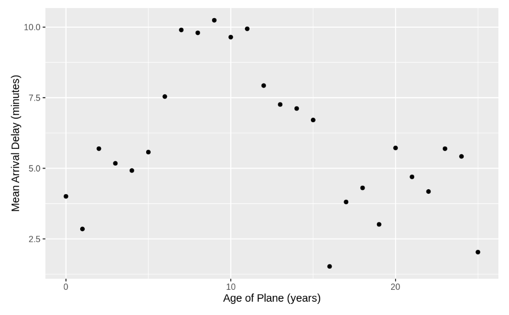
dep, arr 모두 항공기 연식이 10년에 가까울수록 평균적으로 delay가 길어지고 그 뒤로는 점점 짧아지는 것을 확인할 수 있다.
-What weather conditions make it more likely to see a delay?
어떤 기상조건에서 delay가 많이 나타나는지 확인해보자.
flight_weather <-
  flights %>%
  inner_join(weather, by = c(
    "origin" = "origin",
    "year" = "year",
    "month" = "month",
    "day" = "day",
    "hour" = "hour"
  ))
우선 key값이라고 생각되는 weather table 시간(year, month, day, hour), location(origin)을 기준으로 flights table과 weather table을 inner join했다.
우선 weather table에 존재하는 precip(강수량)이 delay와 관계있을 것이라 생각했다. precip으로 그루핑해서 dep_delay의 평균을 구한뒤 시각화해보자.
flight_weather %>%
  group_by(precip) %>%
  summarise(delay = mean(dep_delay, na.rm = TRUE)) %>%
  ggplot(aes(x = precip, y = delay)) +
  geom_line() + geom_point()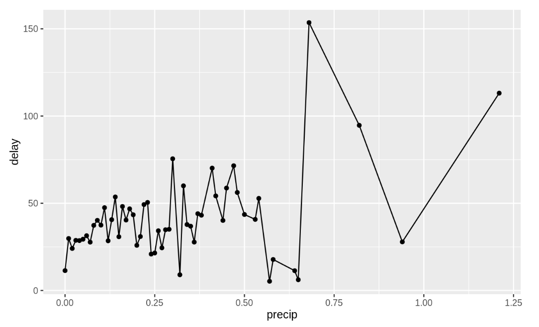
어느정도 관계가 있어보이긴 하지만 더 확실한 변수가 있는지 확인해보자.
가시성과 delay의 관계를 시각화.
flight_weather %>%
  mutate(visib_cat = cut_interval(visib, n = 10)) %>%
  group_by(visib_cat) %>%
  summarise(dep_delay = mean(dep_delay, na.rm = TRUE)) %>%
  ggplot(aes(x = visib_cat, y = dep_delay)) +
  geom_point()
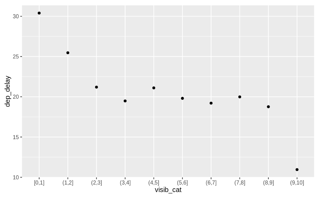
가시성이 2미만일 경우 delay가 길어지는 것을 확인할 수 있다.
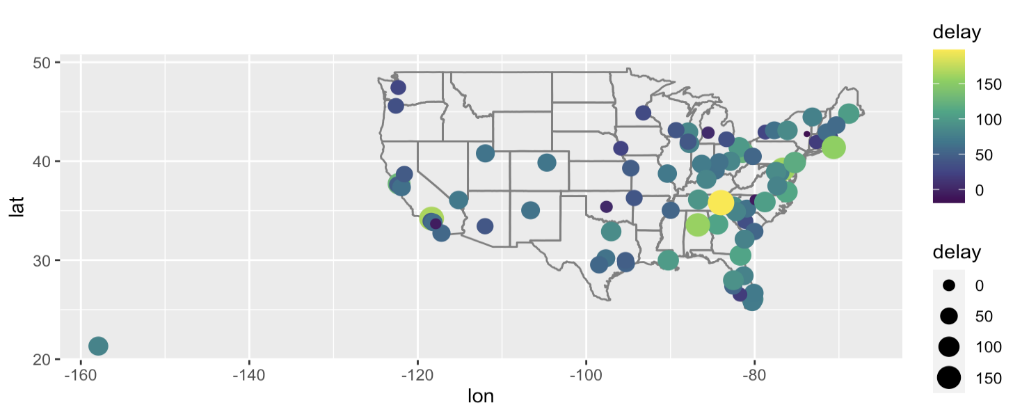
- What happend on June 13 2013? Display the spatial pattern of delays, and then use Google to cross - reference with the weather
flights %>%
  filter(year ==2013, month ==6, day == 13) %>%
  group_by(dest) %>%
  summarise(delay = mean(arr_delay, na.rm=TRUE)) %>%
  inner_join(airports, by = c('dest' = 'faa')) %>%
  ggplot(aes(y=lat, x=lon, size = delay, colour = delay)) +
  borders("state") +
  geom_point() +
  coord_quickmap() +
  scale_colour_viridis_c()
filter함수를 사용해 2013년 6월 13일 데이터만 필터링하고 dest별로 그룹핑한뒤 arr_delay의 평균을 summarise() 함수를 사용해 집계하였다.
그리고 공항이 위치한 지역과 비교를 위해 airports table과 inner_join()을 사용했다.
위에서 배운 미국 맵 그리기 코드를 참조하여 시각화.
- set operations
- intersect(x, y) : 교집합
- union(x, y): 합집합
- setdiff(x, y): 차집합
- excercisecode
1. origin, dest 에 location(lat, lon) 더하기
flights %>% View()

airports %>% View()
데이터 파악하고 main 되는 data frame은 flights. flights$origin의 위치를 붙이기.
flights1 <- flights %>%

  left_join(airports %>% select(faa,lon,lat),

            by=c("origin"="faa"))

flights1 %>% View()
flights$dest의 위치 붙이기.
flights2 <- flights1 %>%

  left_join(airports %>% select(faa,lon,lat),

            by = c("dest"="faa"))

flights2 %>% View()
# Is there a relationship between the age of a plane and its delays?
flights %>% View()

planes %>% View()
Flights에 plane데이터 join하기
flights1 <- flights %>%
  left_join(planes %>% select(tailnum,year),
            by="tailnum")

flights1 %>% View()
Age column만들기
flights2 <- flights1 %>% mutate(age=year.x-year.y)

flights2 %>% View()age와 delay관계확인
cor(flights2$age,flights2$arr_delay,use="complete.obs")