
matplotlib 모듈을 이용하여 그래프를 표현해보자.
우선 numpy와 matplotlib을 불러보자.
import numpy as np
import matplotlib.pyplot as plt
%matplotlib inline%matplotlib inline은 주피터에 그래프를 띄워준다.
우선 그래프로 표현할 벡터들을 구해보겠다.
# <in>
np.random.seed(100)
x = np.linspace(0, 10, 11)
y = x ** 2 + x + 2 + np.random.randn(11)

print(x)
print(y)


# <out>
[ 0.  1.  2.  3.  4.  5.  6.  7.  8.  9. 10.]
[  0.25023453   4.3426804    9.1530358   13.74756396  22.98132079
  32.51421884  44.22117967  56.92995667  73.81050417  92.25500144
 111.54197301]
이제 x, y를 그래프로 표현하자. 그래프는 plot(선 그래프), scatter(점 그래프), hist(히스토그램) 등 다양하다.
- plt.plot()
우선 plot 함수를 이용하여 선 그래프를 그려보겠다.
# <in>
np.random.seed(100)
x = np.linspace(0, 10, 11)
y = x ** 2 + x + 2 + np.random.randn(11)


# <out>
plt.plot(x, y) # 선 그래프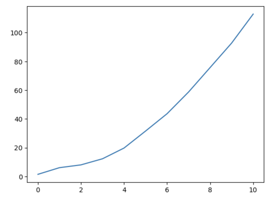
이번엔 scatter 함수를 이용해 점 그래프
# <in>
np.random.seed(100)
x = np.linspace(0, 10, 11)
y = x ** 2 + x + 2 + np.random.randn(11)
plt.scatter(x, y) # 점으로 이루어진


# <out>
이제 그래프에 주석을 추가해보자. x, y축 및 타이틀을 추가해 줄 수 있다.
# <in>
np.random.seed(100)
x = np.linspace(0, 10, 11)
y = x ** 2 + x + 2 + np.random.randn(11)
plt.xlabel('X values')
plt.ylabel('Y values')
plt.title('X-Y relation')
plt.plot(x, y)


# <out>

- 그래프 gird추가, x, y축 범위 지정
# <in>
np.random.seed(100)
x = np.linspace(0, 10, 11)
y = x ** 2 + x + 2 + np.random.randn(11)
plt.xlabel('X values')
plt.ylabel('Y values')
plt.title('X-Y relation')
plt.grid(True)

plt.xlim(0, 20)
plt.ylim(0, 200)

plt.plot(x, y)


# <out>
plot함수의 다양한 parmeter
- 그래프의 형태에 대한 제어를 가능하게 해주는 다양한 parameter가 있다.
- plot함수 도큐먼트
https://matplotlib.org/api/pyplot_api.html#matplotlib.pyplot.plot
matplotlib.org
대표적인 예로 색상의 변경, 선의 스타일 변경, 그래프 두께의 변경이 가능하다.
plt.plot(x, y, '#ff00ff') # 색상의 변경 RGB 코드를 응용할 수 있다.plt.plot(x, y, '-.') # 선 스타일 변경plt.plot(x, y, 'g^') # 녹색(green)화살표 선plt.plot(x, y, 'm:') #점선plt.plot(x, y, 'm:', linewidth=9) # 점선인데 라인두께 9- keyword parameter 이용하여 모든 속성 설정
- https://matplotlib.org/api/pyplot_api.html#matplotlib.pyplot.plot
- color
- linestyle
- marker
- markerfacecolor
- markersize 등등
https://matplotlib.org/api/pyplot_api.html#matplotlib.pyplot.plot
matplotlib.org
plt.plot(x, y, color='black',
	linestyle='--', marker='^',
	markerfacecolor='blue', markersize=10)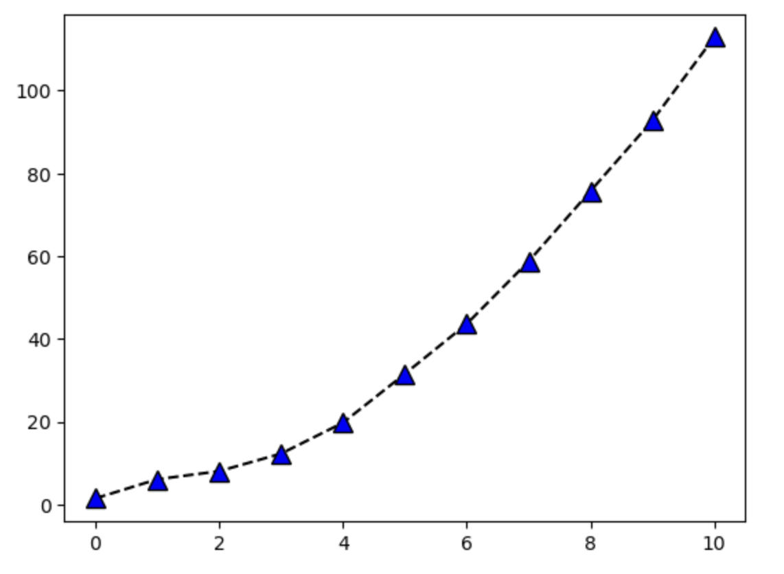
- subplot으로 여러 그래프 출력하기
- subplot함수로 구획을 구별하여 각각의 subplot에 그래프를 출력할 수 있다.
plt.subplot(2, 2, 1)
plt.plot(x, y, 'r')

plt.subplot(2, 2, 2)
plt.plot(x, y, 'g')

plt.subplot(2, 2, 3)
plt.plot(y, x, 'k')

plt.subplot(2, 2, 4)
plt.plot(x, np.exp(x), 'b')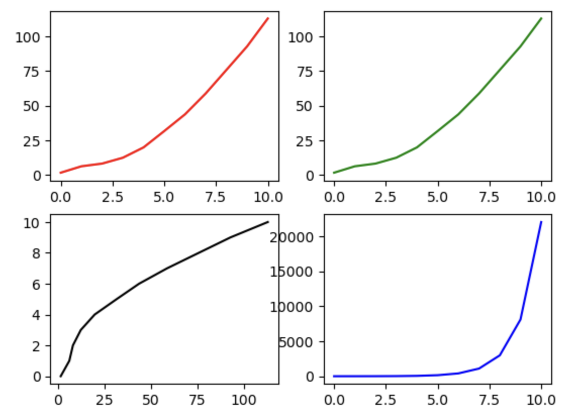
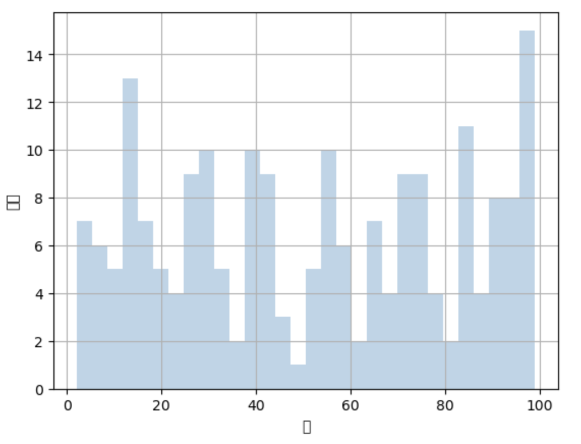
- hist (히스토그램) 생성
bins로 histogram bar 개수 설정 가능
data = np.random.ranint(1, 100, size = 200)

plt.hist(data, bins = 30, alpha = 0.3)
# bin : 막대그래프 개수, alpha : 그래프의 투명도
plt.xlabel('값')
plt.ylabel('개수')

plt.grid(True)
'python > numpy' 카테고리의 다른 글
| 11. numpy 이용 - 로또번호생성기, 원주율계산 (0) | 2023.02.17 |
|---|---|
| 9. linalg 로 선형대수 연산하기 (0) | 2023.02.16 |
| 8. boolean indexing (0) | 2023.02.16 |
| 7. broadcasting (0) | 2023.02.16 |
| 6. axis의 이해 - axis를 파라미터로 갖는 함수 - (0) | 2023.02.16 |